Monday, December 5, 2016

Levity Apparel Artifacts

Levity Apparel Logo: 

Levity Apparel is a company targeted towards young adults that can relate to the companies motto of "Live more, Stress less, you do you!" and having a "lightness of mind" therefore I wanted to brand this company in a way that would be appealing to the eye and emulate the phrase that the company has adopted as their way of life and the type of people they are trying to attract with their clothing and brand. We wanted to create something with the rebranding that is simple yet interesting that anyone could recognize and would give the company a very clear identity. 

Logo design: 

The logos that I created I designed to represent a Wheel, because the company represents a type of person who is interested in cars, with curved shapes that represent flames. I wanted to represent a logo that targets a specific audience.  That audience has a love for cars, including fast paced thrill seekers, living in the moment and knows how to leave the world behind.  The kind of person who doesn't have many cares in the world and loves to drive.  The motto - live more, stress less.  

There is a balance of contrast and harmony with these designs as well as some gestalt principles that are important to add for any good logo. there is definitely a contrast in shapes from the very geometric Circle creating the wheel to the organic shape of the flames that makes the design more appealing, interesting, and memorable. Also the size contrast is apparent as well, the size of the flames and how they get smaller as it rises give the design depth and movement. The contrast in the design gives it harmony and turns the logo into a cohesive object instead of just shapes put together. I also wanted to incorporate the gestalt principles with the logo design and a figure ground relationship. The cutouts of the wheel incorporating the flames that move behind the wheel and get smaller give the design a figure ground relationship altogether creating a cohesive shape. Along with Figure/ground there is also a good use of negative and positive space with the design. There is the law of similarity and and proximity with the similar shapes of the circles and the curved flame shapes grouped those figures together. There is also the law of continuity because the eye follows a path with these shapes and give it a sense of movement and direction. The design is looked at its simplest form, and it is actually a group of complicated shapes so it also has the law of pragnanz. Lastly I noticed the law of closure with the cutouts created that makes the eye group those shapes as a whole. 
I also created this logo to give the company more options and a variety of designs to use for their branding and merchandise. I wanted to create something a little more simplified and something that goes back to more vintage logos that can be used for a variety of things. the design and color is very simplistic and I added the flame to incorporate flames so each design is cohesive. 

There is a contrast of shapes with this design the lines and the circle.  There are also Gestalt principles demonstrated in this logo design as well. The lines create shapes that group them together using the law of similarity, and they are near each other so that also showcases the law of proximity. The letters are the same type and the same placement the eye groups them together. I also wanted to create some logo designs that would work well for web design that could be any color and shrunk any size. Also that work with the axioms of web design that has been created and used for the website design, such as continuity, which has been used for this logo, a grid, and contrast. 


Packaging: 

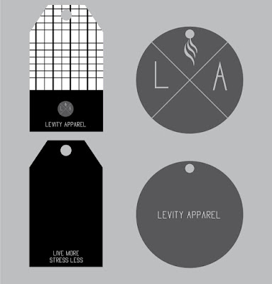
I wanted to create something for this company that shows the buyer that the company cares even after the purchase with something that adds extra detail and thought to make someone want to buy more. I think it is extremely important for a company to put thought and effort into the details and designs of the packaging to showcase the company and that they really care about the person buying from them.  

There are also several design aspects used for these clothing tags, I will mostly discuss the tag on the left. There is a contrast with the lightness of the pattern and the solid black, there is also a difference in textures created by the pattern. It gives the design a sense of harmony and balance because of the placement of the pattern and the contrasts. I felt like the composition of the tag with the business of the pattern and the contrast of the black, balance each other out. There are also gestalt principles used. The pattern showcases the law of similarity, continuity, and proximity. The lines create movement direction, and interest because of these gestalt principles. These tag designs also followed the style guide with the simple colors and sharp typeface it showcases the cohesive look of all the products and designs. 

Tuesday, November 29, 2016

Levity Apparel Style Guide

I have designed a style guide that is appropriate and I think will attract the targeted audience for Levity apparel.

Thursday, November 17, 2016

Levity Apparel Audience description

Levity Apparel Audience description 

Tomboy -
18 - Taylor Oliver, From Utah.  Taylor wants to roadtrip new places. She is super adventurous and a tomboy. Has always hung out with guys in high school and is always considered one of the guys. With her clothing she is drawn to anything comfortable and easy going. Her go to attire is jeans, a t-shirt and a pair of vans. Taylor grew up with all brothers and has always been into skating. Any free time Taylor has she spends at the skatepark trying out new tricks. She is drawn to this clothing line because of its comfortable fit and cool designs. She has always worn guys clothing so she loves anything more masculine. This clothing line also allows taylor to be active with her skating and traveling.

Rock  Musicians -
John Freeman, age 21, lives in Utah. John is a music head. He can always been found with headphones on, listening to the newest indie rock album. He will always talk about how he knows all the members to his favorite indie bands and spends all of his paycheck on going to their concerts. He loves clothing that represents his “edge” and his laid back demeanor. That’s why he chooses Levity Apparel. Not only they have designs for when he is chilling with friends, but also has designs for when he goes out to drink and smoke. Not that it matters to him, since, you know, he is so cool and all.

College/High school  drivers

24 - Jackson. Lives in the Southern utah area and recently graduated from DSU. Drives a 2003 subaru wrx. He often uses his car to go camping and snowboarding. His job allows casual apparel in the workplace so he is looking to grow his closet of clothes. He likes clothing companies that reflect his emotions and values. He likes to show off his branding of clothing on his car with decals. With his free time he likes to go to car meets and hang out with his friends there.  


I am assigned to creating the style guide and making sure we get some new fresh colors and looks for this company. I also am going to make a new logo for the clothing, and I want to create some sort of car wrap because it pertains to this particular audience.

Wednesday, November 9, 2016

Mis-en-Scene


Art Directors are in charge of anything to facilitate and ensure the production designer’s vision and creative ambition. The art director is responsible for the visual identity of the film, and to over see the art department, meaning the wardrobe, makeup, and set deign is all taken care and visually pleasing. 

In the film Pirates of the Caribbean:  The Curse of the Black Pearl here are four credited Art Directors involved Derek R. Hill, Michael Powels, James E. Tocci and Donald B. Woodruff. researching each of these directors I noticed that most of the credited art directors were usually part of the film as a set decorator or production designer. Derek Hill is is known for production design usually for tv series, such as the Tv series House, and there are only eight productions where he assists as an art director.  Michael Powels is known for his role in the art department. He was a carpenter and involved in the art department for movies such as Star Trek, mission impossible III, and Van Helsing. James E. Tocci, is known mostly for roles in the art department as a set designer for hunger games , and also was an art director for other popular films. Lastly Donald Woodruff is known for his art direction in his set design in films such as 50 first days, Jaws, and A Series of Unfortunate events. Taking a look at each of their work, it is clear how important the art needed to be in this film. I noticed that most of these men are set designers and I thought that was exactly the kind of people that a movie involving a time period and lots of props and costumes would need; creative minds. I also noticed how dramatic and creatively put together their previous films are and I think that was a huge part of why they were put together to make a visual impact and work together in this film. All the costumes had to be effective the ships the lighting where all thought about and looked over by the art department and the art directors. The sets needed to be effective to make the onlooker feel like they were watching pirates and stepping back in time, This is a time period piece so there needed to be a lot of thought into the art associated with it. For instance the costuming was researched and thought about thoroughly, each item of Captain Jacks costume means something and is significant. There is a bone in his hair that represents a reindeer bone and it was used to mend sailing and riggings. Clearly this movie needed many hands and creative minds to pull it off. 

This First scene from the first Pirates movie, is very significant. It sets an expectation for the rest of the film. There are many design aspects within this first scene. The lines created throughout the movie are extremely prominent. It is seen from the lines in the ship and the horizontal line created by the ocean is very effective too. There is form,  from the ships and the pirates hanging off the cliff, also the colors and textures are significant with the colors of the sky showcasing mood of captain Jack and the texture of his clothing and everything he has on his body are taken into account. the Gestalt laws are also present. There is similarity grouping the three dead pirates together, there is similarity with pieces, or patterns made in captain jacks Ship. I noticed that the law of continuity was present but poorly done. The first shot of the movie the time of day seems to be dawn or sunset, and then the next scene skips to mid day. The continuity is not fluid but the law is present. I noticed the figure/ground with the cliffs and ships, and jack as the focal point and in focus. There are many design aspects that are thought about an planned that are very important to the film. 

Taking a look at all the people involved in the film and their massive role as art directors, it is clear that their work paid off in Pirates of the Caribbean:  The Curse of the Black Pearl  With the design aspects that are used and how much though they put into the costumes and sets and location I think these art directors created something truly amazing. They are creative in so many different ways and are able to make the viewer feel transported to that time period and thoroughly entertained. 


Thursday, October 20, 2016

Compose your frame


I work at the academic advisement center and I took this photo at the front desk. Even in such a simple place there are several photography aspects that I found. The rule of thirds I noticed first,  the bell in the photo is right at one of those points where the lines meet making it a more interesting composition, the other point of interest is trash bin, which is the figure ground aspect of the photo. Also there are some diagonal lines that create a slight vantage point to the windows. This concept gives it a sense of movement and the path that is diagonal gives the eye a something to follow. Although, I don't think the diagonal lines are as prominent as the vectors. The Vectors are the upward points and motion of the vertical windows and most of the lines in this photo are upward. I also noticed the desk edge also is a horizontal vector, giving the sense of motion and direction. 

Monday, September 19, 2016

Design Comparisons

Bad Design

There is a huge contrast between these two designs, with the design principles and just generally what is pleasing to the eye. I was driving out of town over the weekend and I saw the St George shuttle on the way to Vegas and I noticed what a poor logo design they have. There is no sense of Similarity, the font and lettering is fine, but each individual letter is a different size so it doesn't let you group the image together making it seem very separate and not cohesive. I also noticed that there is a poor figure/ground design with the sun and the red cliffs, but it also makes the logo separate as well, it just isn't very clear when first looking at it. There is contrast with the coloring and the figure/ground work, but to me it is not successful. With the red typeface, the black and the yellow background the contrast is more of a disconnect rather than effective.

Good Design 


There definitely is a difference between the two different designs, with the typeface, the colors and design principles, it is clear that the RydenFly shuttle service has a better design. this design has bright colors that are pleasing to the eye and I like how there is a change of color with the "n" between "Ryde" and "Fly" they used the law of symmetry and proximity with the colors, grouping the two words together. There is the Law of continuity also is suggested in this design, with the horizontal stripe on the van itself, drawing the eye along to the front and back of the car. I also thought it was nice to have the "airport shuttle" in white as well because it makes the image more cohesive with the "n" as white also. The image of the plane is very suitable and makes the onlooker know what the service is, and it uses the same color scheme grouping it to the wording. There is a lot of contrast within this design, the bright green and the blue are very different making the wording pop and the white letters to stand out as well.

Sunday, September 4, 2016

Contrast, Harmony and Balance

This photograph is a great example of contrast, Harmony, and Balance. This photo spoke to me, with the amount of design principles and the sense and amount of dedication that this Ballerina demonstrates in a single pose. The onlooker of the photo can relate because this photo is more than just a ballerina, there is a sense of determination and how beautiful something can be when someone is determined and committed.  

I love the negative and positive space or figure ground created in the photo and the distinct contrast between the two, the black background and the light fabric of the girls clothing. There is the law of similarity in the ballerina's skirt texture, making the eyes group it together. The Law of proximity is present with the girl's arms and legs, they are similar and her legs are farther back so they look smaller giving the photo depth. In the Photo there is definite continuity and ease that draws the eye around the photo smoothly. 

There is definite shadow and highlights in this photo, because of the black and white coloring. Texture is present, I noticed it especially in the skirt, and it draws the eye to the girls head and her arms. It focuses on that she is doing, rather than her face, her head and face are part of a shadow making it less important in a way.  

The orientation of the photo is very traditional. The Ballerina is in the center of the photo, and her body and pose is completely symmetrical. This symmetry was used to showcase the center an her position. The Symmetry creates a very clear sense of balance and harmony. I also notice that the skirt is a circle and her arms are curved to create a round shape as well and that gives the photo balance, and there is harmony because of the symmetry of the photo, the onlooker can tell or feel that the photo is all together in a way that is pleasing to the eye. Overall this photo shows the design principles clearly. 


Monday, August 29, 2016

Visceral Response

There are many things that are beautiful to me, but the most significant beauty happens when there is a memory attached.This is a photograph that I took on a trip between my junior and senior year to Europe. It is hard to express the feelings I had and the beauty I saw while I was there, it was always a dream of mine to see that part of the world and with hard work I was able to raise enough money to get myself over there. This photo was taken in a little town in Italy called Assisi, this town is set on a hill and overlooks the Italian countryside. Within the town there are so many nooks and hidden places and every time I look at this photo I took, memories of the trip come flooding back, and there is such a beauty to those memories. 

There are many design elements that express the beauty that I feel when I look at this picture. The lines in the photo lead your eye around a corner and I am aways curious what would be the destination of following the alleyway. I love the shadows that are present in this photo, it creates a sense of mystery and curiosity. The Color is this photo also plays a huge role. There are soft greens from the plants and the majority of the photo has muted tones and the gray and tan colors from the walls and street that also give off the sensation of curiosity and charm. The shapes are very soft an warm looking from the worn down cobblestones to the Italian dining tables that are very inviting. Although this is just a photograph there is a definite form, whenever I look at it I feel like I am right back in Italy and walking those cobblestone streets. I also think this sense of awe and wonder is created by the texture of the photo, I can imagine if I were to touch the walls or the ground how it would feel. 


It is amazing to me how one photo can stir my emotions and urge me to explore and travel. This is such a stupefying photograph and there sometimes it is hard to express the beauty and sense of longing that I get whenever I look at it.